Friday, January 10, 2014

Excellent Resource Links (Books, Videos, Materials, Etc.)

Link for Color Frontier's Gridded Color Charts 
http://colorfrontier.com/

Graphic rendition of a Color Chart after mixtures are applied
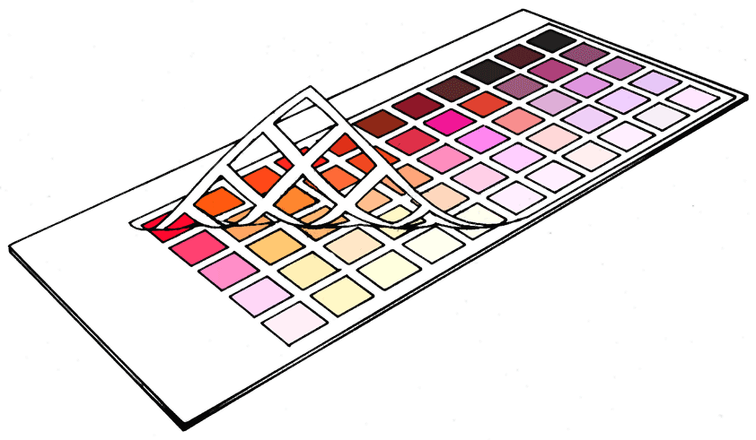
This site offers great color charts with peel away gridding.  Simply paint assorted mixtures in each of the "windows" of the grid.  When finished, peel away the grid and you will have a neatly bordered, sturdy color chart to refer to as you paint.


Link for Portrait of Maquoketa by Rose Frantzen

http://www.oldcityhallpress.com/index.html


An amazing resource for portrait painters and students alike!   This book features 180 portraits by Rose (many are presented in the book full size). The folks who posed were all citizens of Maquoketa, Iowa, Rose's hometown. 

Rose completed the paintings in a storefront on Main Street - in only 4 to 6 hours each!  Don't let the speed of her work fool you - she is a very gifted artist who is able to capture the personality and spirit of the people she paints.  Her project of all 180 portraits was featured at the Smithsonian Museum last year!

Most of the images in the book are life size - so all the various skin tones, edges, colors, values and brushstrokes can be seen!  The book not only includes her Portrait of Maquoketa project, but also many of her other works - still life, landscape and figurative.

Rose is a faculty member for the National Portrait Society of America and she recently won the People's Choice Award at their Annual Conference.  She studied at the Palette and Chisel with Richard Schmid, as well as at the Lyme Academy of Fine Arts.  Rose is represented exclusively by Old City Hall Gallery in Maquoketa, Iowa.  She offers workshops at her studio in Maquoketa and at the Scottsdale Artists' School in Scottsdale, AZ.

Link for  Not Far From Home by Daniel F. Gerhartz

http://webfarm.foliolink.com/Asset.asp?AssetID=59227&ArtistID=36476&AKey=HTDFQTVK

This is another wonderful resource!  Dan is a very gifted painter who creates beautiful figurative and narrative works.  He is inspired by Russian, European and American masters including Nicolai Fechin, John Singer Sargent, Joaquin Sorolla, Carl Von Marr and Anders Zorn.

With the guidance of instructors Richard Schmid, John Baitinger and Bill Parks, Daniel F. Gerhartz studied and practiced painting and has established himself as on of the top representational painters of our time.  Dan offers painting workshops at his studio in Kewaskum, WI.

I also strongly recommend his DVD, which is entitled Her Mother's Locket. 
The lessons are a step-by-step journey through the painting, from initial drawing and block in to final stroke.  The DVD presentation lasts about 8 hours and is jam-packed with wonderful insights, demos and inspiration!  It is available at:
http://www.danielgerhartz.com/Asset.asp?AssetID=59223&AKey=HTDFQTVK

PS
Dan won the top award at the Art Renewal Center's first annual Salon!  You can view the winning painting here:  http://www.artrenewal.org/articles/2004/Salon/winners1.php

Thursday, January 9, 2014

Oh, What a Difference a Few Changes Make!

 Looking objectively at our "finished" paintings 
can really make a difference! 

Being willing to redo, or even wipe out (gasp!),
an area that we slaved over can be
the best possible tack to take to improve our work.

 
 Keeping that concept in mind, here's your chance
to identify assorted "redo" areas and even "wiped out" areas in these two paintings. 

We will take a look at these two totally different paintings,  one bright and full of color, and the other more subdued with nuances of color, light and shadow.
 
   Let's start with the painting of the flowers.
  After leaving the pink and yellow roses to move on and paint the silver teapot and white pitcher, I returned a few days later to take a fresh look at the flowers in the vase -  and decided they could use some adjustments.

Here are some Before and After images of the same flowers.
Can you find the modifications made to the pink roses?

Specifically what differences can you see
between the two paintings?  Don't the changes make the pink roses "fresher" and more "crisp" ?

EXAMPLE ONE - - BEFORE IMAGE

 
EXAMPLE ONE -- AFTER IMAGE
EXAMPLE ONE -- FINAL IMAGE

(*color a bit off, but wanted to show the "final" version)
 
 
We can make similar changes to whole paintings -
now compare the Before and After images for my painting entitled Along the Silk Road (below). 


EXAMPLE TWO -- BEFORE IMAGE
                                                  
This was one of my very earliest still life paintings - and as a beginning painter, I struggled with many of the objects as well as the composition. I seem to have made every common mistake, as new painters will sometimes do! 
 
Let's analyze:
  • Looking at the super-white cloth peaking out from under the rich, black cloth, it's clear there's too much contrast.
  • The apple on the right has stolen the show due to the odd placement and color/value contrasts. 
  • Now, what about those grapes pouring out of the copper container? There are way too many grapes - and they create a distracting "border " of sorts around the middle apple. 
  • Also, notice the very "stiff" depiction of the statue? How to make him appear more relaxed and dimensional?
  • Lastly, what about the large, blank area of the background into which the man/statue seems to be looking?  In fact, our eye doesn't travel easily around the painting. The painting seems cut in half diagonally. The flow is interrupted.  Perhaps rearranging objects (apples) and adding something (the large ornate disk) will balance the painting and help the viewer's eye circle back through the composition.
Hmmm, lots of adjustments seem to be in order - so, scroll down further to see the latest (though not yet complete) version of the painting.
  
EXAMPLE TWO -- AFTER IMAGE 
(*see final comments below this image)


How many differences can you find
between the before/after images?
 
(HINT: Consider: objects included or deleted, color adjustments, temperature changes, modifications to objects already painted, reflections, shadows, etc.)

Please note, this painting is not yet finished -
it still need some work in a few areas, such as with
the roses and the shadows of the apples.

Okay, now it's your turn to "revisit" some of your older works -
perhaps with a little thoughtful tweaking they can be improved, too!


Saturday, January 4, 2014

Terrific Artwork by My Students!!!


Greetings!!

Here are a few dozen paintings created by my wonderful painting and workshop students!  I've done my best to scroll through the 6,000+ photos on my phone in order to download all the images I've taken lately of my students' work, but surely, I've accidentally missed a few.  Please forgive any oversight and let's make arrangements for your work to be included in the next blog entry of "Terrific Artwork by My Students!!!"

PLEASE ENJOY!!


Hope you enjoyed the exhibition, thanks for allowing me to post your work!!!