Friday, December 13, 2013

Painting Folds in Cloth (*In Shadow and Light)

The technique used for painting folds is similar to that for painting water - simply "forget" what you are painting! 

Of course we can't really forget we are painting cloth, but if we strive to ignore common thoughts such as, "I think folds should do this and folds ought to do that," we can instead focus on recording only what is there before us, and before long, it starts to resemble cloth!

Here are a few photos of a recent painting session with the various stages of painting a green scarf/shawl/cloth.

Stage One
Rough in the general folds with assorted temperatures of green.  The cool light from the window (left) creates cool/bluish greens.  The warm overhead light creates warmer ,and more vivid, yellow greens.

Stage Two
The cloth is filled in to create basic folds - hills, valleys, turns, reflections. Sharp and soft edges are formed.  A light burnt sienna is laid in to represent the table (just for now).

 
Stage Three
Lots of light is added - trying now to separate the cloth into only two sections, an area in shadow and an area in light.  Also added "reflected light" on folds and deepest shadow.
 
Also making sure the full area in the light has three parts/areas:  a "lightest-light, a moderate light, and a darkest-light."  Making sure the shadows have a "lightest-shadow area, a moderate shadow area, and a darkest shadow area." 

 
Stage Four
Backing up to see the painting as a whole - asking myself some questions:
 "Does it read as true?" 
 "Do I believe its dimentionality, its color, its texture, its shadows?" 


Suggestions:
 
If you squint, most of the shadow area is similar in value and entirely green, so how can we depict form within our shadow area? In a word, by using temperature!  Notice the use of warm and cool greens (rather than value changes) to depict the mountains and valleys of the folds. 
 

PS See you all in January!  Please feel free to comment - it's a competition!  Whoever figures out first how to comment to a blog post wins a prize to be awarded in class in January!

Saturday, December 7, 2013

Ten Stages Used for Painting Cut Crystal, Water and Stems

One of the most  frequent questions still life enthusiasts ask is, "How can I paint water in a vase realistically?"   Very often, artists will paint a white, blue or green "glass color" for the silhouette of the vase and a "water line" to indicate how high the water is in the vase.  They may make the stems murky and tint them blue or green to imply they are submerged in water.  However, for a realistic look, it may be more effective to forget it is a vase of water and just paint the edges, values, colors and temperatures we see before us. We can paint what we see, and find the water will appear on its own in the vase!
Here are some step-by-step images that may help illustrate this idea.


Stage One:
Determine the size and shape of the vase. (Ask myself, "Does it seem to be able to hold all the flowers?  Is it perhaps too big, too small?  Do I need to eliminate any flowers so they seem natural, not staged?")  
(I decided to paint some background color over the rose that used to be on the far left - it was too far away from the vase to make sense and too "lined up.")
Next, background color was placed right up against the sides of the vase, creating the shape of the vase for the viewer.  

 
Stages Two and Three
 
Background color was added in and around the vase.  I paint any colors showing through the crystal vase, and through the water itself. I pay special attention not only to color, but to value and temperature as well - and transitions between colors are kept very subtle.
 
Stage Four
 
 The leaf caught inside the vase is simplified and the rim of the water is indicated, breaking the leaf into two sections, one above the water, and one in the water.  See how the section beneath in the water is less distinct?
 
Also, a prominent stroke of reflected light on the left of the vase is added.  One "imperfect" stem is also placed with moderate value, temperature and edges.  It's definitely touching the bottom of the vase. A pinkish reflected light is also added.
 
Stage Five
 
A second, greener stem is added. All stems must be carefully aiming toward the bloom of one of the flowers.
 
Stage Six
 
A few more stems are added, one in front of the others, and one behind the others.
 
Stage Seven
 
A fifth stem is added. Notice each is slightly different in color, value or temperature and all the edges are varied - some hard, some soft. The value is lighter and darker, sometimes from the left to the right, sometimes rom top to bottom. The bottom of the vase has been more defined.
 
Stage Eight
 
The last of the stems are added.  Four evenly spaced cuts in the crystal are begun.  They vary a great deal (within each one, and as compared to each other). Notice they do not stay the same value for long, nor the same color - they are reflecting surrounding colors as well as both direct and indirect light.
 
Stage Nine
 
Additional cuts in the crystal at the top area of the vase are added.  Any cuts not seen are not painted (very tempting to add what "should" show, but doesn't). The cuts are made with bold colors reflected from the foliage and surroundings.
 
 
Stage 10
 
Close up of the rim of the vase, with start of cuts in crystal.


 Stage 11
Final version of vase - before teapot and other objects are added.
 

               Coming up in the next post, the green cloth (in light and shadow) and draped near and around the vase!!


Monday, November 25, 2013

Painting a Rose - Hit by Full Light

Here is "Part 3" of the Process for Painting Roses

In the previous two posts, I described a process I have found helpful for painting roses. 

First, I emphasized the importance of getting the size and silhouette correct as you find the correct values with which to fill in the different areas of your rose. (It's interesting how the silhouettes of roses are always so different from one another, yet we always recognize a rose silhouette when we see it!)
Next, I stressed the need to stay aware of temperature and color saturation. 

In this post, I am focused on the need to avoid using lines or dabs of color, but rather to build the form of the object with your strokes, paying close attention to both saturation and temperature. Try to notice the direction and other qualities of the strokes you see.

Remember -  you can click on any image to ENLARGE it.


1. Starting with a much warmer block in - since the bright light (from the above right) that is hitting the rose is warm in temperature.

2. Carefully adding rich darker values to the block in.
 

3. Adding cooler petals that are reflecting the blue light coming from the window to the left.

4. Adding very rich, golden light shining through the petals.  
 
5. Cutting in with the green of the background to create a more accurate silhouette (see petal on the far left/top).  Adjusting the values to be more consistent with the rose I see before me.

6. Adding the very high value edges of petals that are being hit directly by the light above.  


7. Backing up, now and then, to be sure the values and colors/temperature/intensity are reading correctly in relationship to the rest of the painting.   
8. This is also when the shadows cast by the center petals onto the outer petals were finalized.


8. The completed rose!
 I hope this series of three "mini lessons" was able to give you some insights for painting roses. 


Painting a Yellow Rose in Shadow

Here is "Part 2" of the Process for Painting Roses. 

In the previous post, I stressed a step-by-step approached for painting roses.  I emphasized the importance of getting the size and silhouette correct as you find the correct values with which to fill in the different areas of your rose

In this part of the lesson, I'd like to stress the need to stay aware of temperature and color saturation.  In the photos below, you'll see the stages of development for a yellow rose - mostly in shadow.

(The next blog post will show the yellow rose hit by full light.) 
 
1. Finding the silhouette, size and placement - using a cool neutral to begin the flower.


2. Color saturation is lowest in bright light or shadow, and highest where light is actually shining through an object, or hitting an object.  In this case, the object is a petal.

 
3. Squinting down to see shapes, edges and values.            4. Opening eyes to see color and temperature.
 
 
5. Starting to add the leaf behind the flower - to help it "come forward" in the bouquet.
 
 
 6. Notice how mild and unsaturated the color is in shadow? Only the deepest crevices or petals with reflected light have rich color showing.
 
 
7. Note the edges are purposely varied - some are soft/sharp, while others are lost/found.
***The next post will show the process used for painting a yellow rose in direct light.


A Process for Painting Roses

From the time I was little, before I actually knew anything at all about how to paint, I'd love to visit galleries and museums.  

How about YOU?  Weren't you in awe of those huge murals, lifelike portraits and lovely still life paintings - especially if they included roses?  

I confess, I'd practically press my nose against painting after painting to see brushstrokes and colors up close!  Amazed (and frustrated), I'd wonder, "How did the artists capture such lovely color?  How did they actually begin?  How did they get that shadow so soft - and portray the light so well? What steps were followed? If only I could watch as they painted!"

Perhaps the photos and comments, offered below (and in the next post) will shed some new light on painting roses in particular.  This illustrates a process that seems to work for me.  Some of the pink roses are in this post, and the larger, yellow roses will be included in the post that follows this one.


(*Click on any image you'd like to see enlarged.) 

1. First, I filled in the various tones of the green background around the roses.  
2. Then, I tried to determine the size and silhouette of each rose. (I chose to start with the darks, first.)

 
3. Here, I tried to stay true to the size and silhouette of each rose.  
4. I started painting the middle tone areas (keeping in mind that where the light was hitting).


5. As I painted, I tried to be sure the "bowl" of each bud was facing the vase at the correct angle. That way, when the stems were eventually added, they would truly seem to be in the vase.   
6. I began to use more of the assorted greens found in the background to fill in the remaining areas between and around the roses.  
7. This is also when I added the bits of "super saturated" color, a fairly dark, rich red that made the roses more defined.
 

8. Then, I began to add the tops of the stems, carefully angling them to face directly into the vase.  
9. I used a grayed-down green on the left of each stem, and a medium value on the right of each stem. 


Here is a final photo of the roses - please note, the photo has altered the color a bit - they aren't quite this vivid, but they are close.   
Notice the different colors in the foliage - there are no solid green leaves and stems - the cool and warm light hitting them create variety of color and temperature. 

Through continued practice and experimenting, you'll soon be painting roses that "sing!" 


Friday, November 22, 2013

Color Mixing Workshop Details


"The FUN-damentals of Mixing Color "


Imagine how much more fun painting could be if we knew, without question, we could mix each and every color we needed for a painting!!!
 
One common but laborious way to approach "learning to mix color" is through a hit-and-miss practice.   However, there is a better, more efficient way - through a few carefully selected lessons and exercises, we can actually  begin to learn a sound and systematic approach professional artists use to "find the colors we need." 

Using this process, we find we are making correct color choices more and more frequently;  we subsequently develop the skill (not intuition) to select and mix colors well.  We continue to become more comfortable with the process, so we become faster and more accurate, until we're on "automatic pilot"!


It's somewhat like learning to drive a car.   At first, there is so much to consider and remember - all at the same time.  Mixing color can feel like that!   We must consider the relative color/hue, temperature, value, and intensity - as well as how various paints interact with each other as we mix them!


Well, the good news is, just as we learned to drive a car, we can learn to mix color!  Each time you parked well, missed hitting the mailbox or drove safely in the rain, your confidence increased, which in turn helped you build your skills. 

This same premise holds true for color mixing....each time we mix a color accurately, we build our confidence as we are building our skills.

 
To that end, there will be a special workshop offered at The Art School to help painting students learn steps to take to more quickly and accurately mix correct colors. 
 
 
"The FUN-damentals of Mixing Color!"
Saturday, December 7, 2013
9:00 AM to 12:00 Noon
 
&
 
Complimentary Follow-Up Practice Session
from 12:00 Noon to 1:45 - the same day, at no extra fee!
 
 
Bring those particular paints, paint palettes, clean quality brushes, a small palette knife and other painting supplies, which we normally use in class, with you to the workshop -- plus a large pad of canvas paper for some of the practice exercises. (*See Supply List provided by the front office at time of registration - or download it from the Art School web site.)
 
A specially prepared full color workbook of concepts, examples and exercises as well as additional materials for the day's activities, will be provided by the instructor.  (*As noted in the course catalog, there is a $10 materials fee for each Color Mixing booklet.). 
 
Sure hope you will join us!


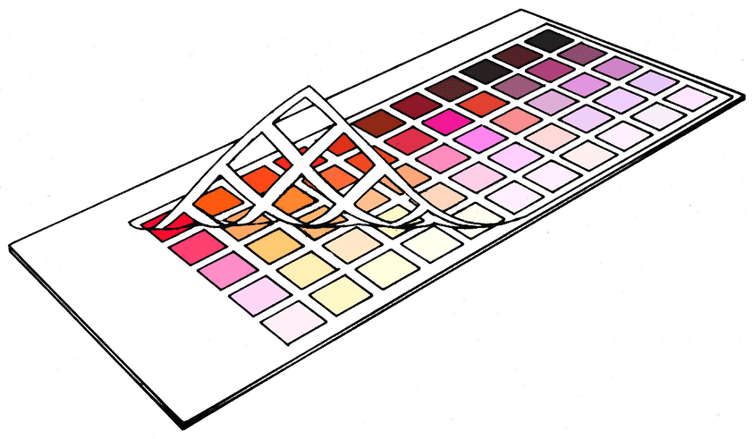
Creating Color Charts Just Got a Whole Lot Easier!


Creating Color Charts? 

Here's a great new tool to make it faster and neater!
Graphic rendition of a Color Chart after mixtures are applied
  This grid is a wonderful invention that makes creating color charts SO much easier - although I have only just discovered these gridded board, I am a fan!  I completed a four color chart on one of the boards and it looks terrific thanks to the peel away grid - and they are endorsed by Richard Schmid, so that's good enough for me!
 
"For anyone deterred from making the very important color charts because of the work involved in preparing the boards and squares, I recommend Randal McClure’s product. I wish his boards were available when I was doing my charts.” -Richard Schmid
 
 
You can take a look and decide for yourself at the website featuring this product.  Just click on the link provided, below:
 
 
They are reasonably priced considering the time they save and their durability - and I haven't found anything like them until now. 

These boards will be a huge bonus to those of us who may put off actually making color charts due to all the time needed to "measure and tape off each little square" on each board!

(**Ask me to show you a completed example when I see you in class! )
 
Warmest regards,
DianeI
 
*Special Note:
If you are attending the FUNDAMENTALS OF MIXING COLOR ACCURATELY WORKSHOP on December 7th, I've already ordered a box of these boards and plan to have at least one available for each person attending the workshop - just in case you'd like to try one before ordering a box for yourself.